Comics when I turned fourteen
The
comics fan challenge of the past day (based on the posts I've seen)
appears to be to post four comics one read (and presumably thought
highly of) when you were fourteen. Eleven, twelve or thirteen (age, not
number of comics) would have been better for me, as by fourteen there
had been some significant financial and creative changes in the wrong
direction, but the assignment's the assignment. Around this time the
financial struggles for the publisher had led to them quietly dropping
the story page count to 18 as they were in a long fight to hold the
cover price of a standard monthly comic to 25 cents.
I decided to narrow it to what I was picking up the month I turned
14, so that would have been comics newly-arrived to the spinner racks
that April, which would have had July as their cover dates.
Working within this narrow band, I decided to go with:
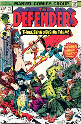
Giant-Size Defenders #5. This story immediately followed the main title's #25, and led into #26, bringing the original Guardians of the Galaxy into the story and setting up a new arc in a less than inspiring way. ("Eelar"? Really?) The cover is a less-than-inspiring Ron Wilson/Al Milgrom combination (apologies to their fans; there's no absolute right or wrong to it, we each have our tastes), and for some reason saw series writer/scripter Steve Gerber joined by co-plotters Gerry Conway, Roger Slifer, Len Wein, Chris Claremont, and Scott Edelmen, in what I at least like to speculate was a fun session by a group of fans turned pro. Interiors were pencils by Don Heck with a mix of inks by Jim Mooney, Mike Esposito and Dave Hunt. Being a prickly, picky bastard of a fan, this was one of many "not my choice" art teams. YMMV. Still, this kicked off another fun story arc, with the time-displaced Guardians stuck in the 20th century.
So, mainly chosen for the writer and the potential brought in by having another Hank on the roster.
Yeah, even a year earlier, when I was 13, I'd have more enthusiastic choices.
Fortunately, they appealed to me, too. A cosmetic downside to this issue is that after several years of my being unhappy with the change to the series cover title "Fantastic Four" style (which they'd changed from the classic original back in issue #119 at the end of 1971) it was as if they said, "Okay, okay. You thought that was bad? Here's one to make you think that second one was really classic and stylish!" So with this issue we were given a flat, italicized style cover title that I can't imagine inspired anyone other than whoever cashed the check for designing it. The new logo was flanked by dull head shots of the quartet, each of whom seemed to be about as thrilled as I was to be anywhere near that logo. Well, someone must have liked it, or they were just stubborn or lazy, because they kept it until issue #218, early 1980, when they finally went back to the Stan and Jack era classic style.


Comments